Thirdi Illustrations: A Design Story
Thirdi
2024
Shipped


Overview
When I first started working with Thirdi, I was pretty excited but also a little challenged. Thirdi is an AI‑powered growth‑marketing platform that unifies fragmented campaign data and surfaces smart, actionable recommendations to drive ROI. My role was to translate abstract product ideas — like Integrations, AI Insights, Smart Campaign and Creative Intelligence — into illustrations that feel clear, human, and scalable across the product ecosystem.
Project snapshot
Role : Lead Product designer
Timeframe: Two weeks
Platform: Desktop
Tools & Plugins : Pen and paper, Figma, Canva, Typescale.
The challenge
The challenge was to make highly abstract SaaS concepts—like integrations, AI-led insights, and campaign creation—immediately understandable through illustration. At the same time, the visuals had to carry Thirdi’s confident brand tone and be flexible enough to scale from small in-app tiles to large marketing decks. Balancing clarity, consistency, and scalability was the real design test.
The goal
Make complex data stories instantly understandable — at a glance.
Ideation and design
Style exploration (3 directions)
When it came to style, I didn’t want to jump in blindly. So I explored three directions:
Flat minimal — clean geometry, strong contrast, super quick to parse (especially at smaller sizes).
Semi-flat with soft depth — subtle shadows and highlights that added a little warmth and hierarchy.
Playful 3D — rounded, dimensional forms that gave a more fun and lively personality.
At first, I was drawn to the 3D explorations as they looked charming and eye-catching. But once I tested them in denser UI contexts, they felt noisy and a bit too playful for a SaaS product.
The semi-flat style was friendlier, but in some cases, it leaned too “floaty” , icons lost their anchor and didn’t sit well with headings.
Through this back-and-forth, I realized the sweet spot was a flat/semi-flat hybrid: clean enough for clarity, polished enough for credibility, and still versatile enough to scale from tiny tiles to presentation slides.
Visual system & composition refinements
Beyond choosing the right style, I also focused on building a visual system that could scale and refining the composition so the ideas felt instantly clear.
Vector-first & scalable
I designed everything in vector (SVG), which meant the illustrations could stretch from tiny cards to full hero banners without losing clarity. A consistent stroke weight and rounded radius language kept the set cohesive across all contexts.
Brand-first palette
I leaned on Thirdi’s violet family and neutral grays, using accent colors sparingly only for platform logos and data highlights. This made the brand voice strong and confident, while still giving just enough visual cues for recognition.
Composable building blocks
Tiles, chips, connectors, and orbiting glyphs were designed as reusable pieces, so the illustrations felt like they belonged to the same world—even when shown in different scenes.
Accessibility by design
I kept strong contrasts for headings and chips, avoiding thin/light grays on white backgrounds, so everything remained readable in UI and marketing contexts.
Visual system & scalability
Vector-first (SVG) with consistent stroke weights and radius language to scale from small cards to hero banners and print.
Limited brand palette anchored by Thirdi’s violet family and neutral grays; accent colors only for platform logos and data chips.
Composable components: tiles, chips, connectors, and glyphs reused across scenes to keep the set cohesive.
Accessibility: sufficient contrast for headings and UI chips; avoided thin/light grays on white
Iteration (what didn’t work vs. what worked)
This is where the back-and-forth happened.
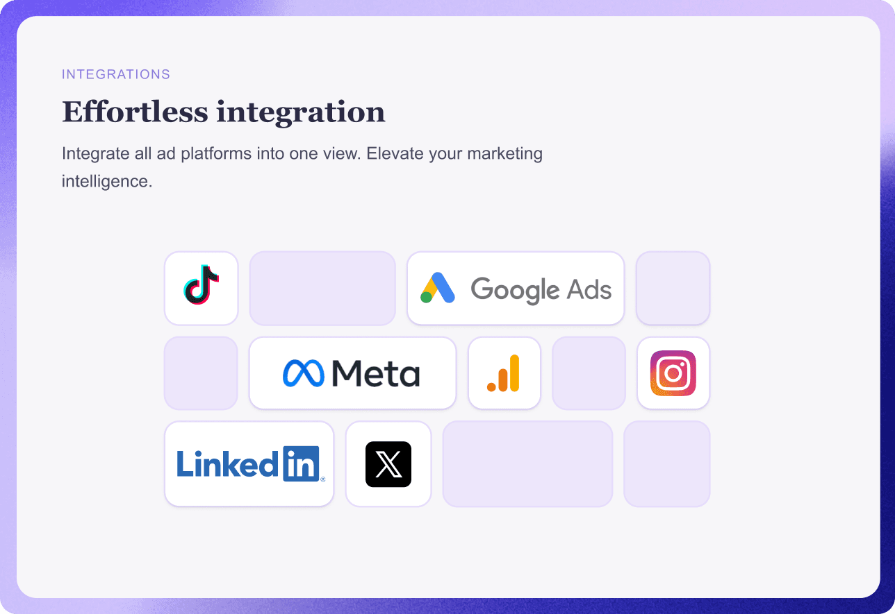
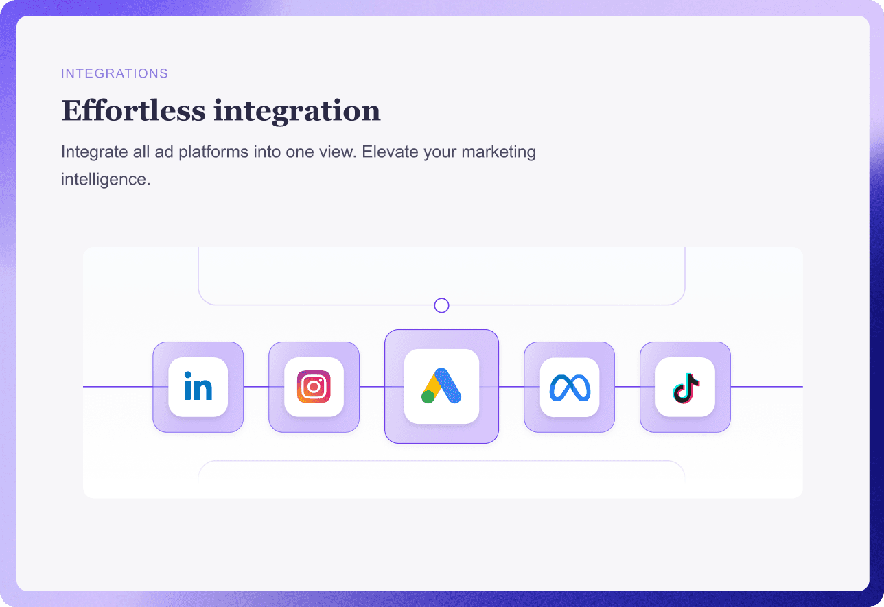
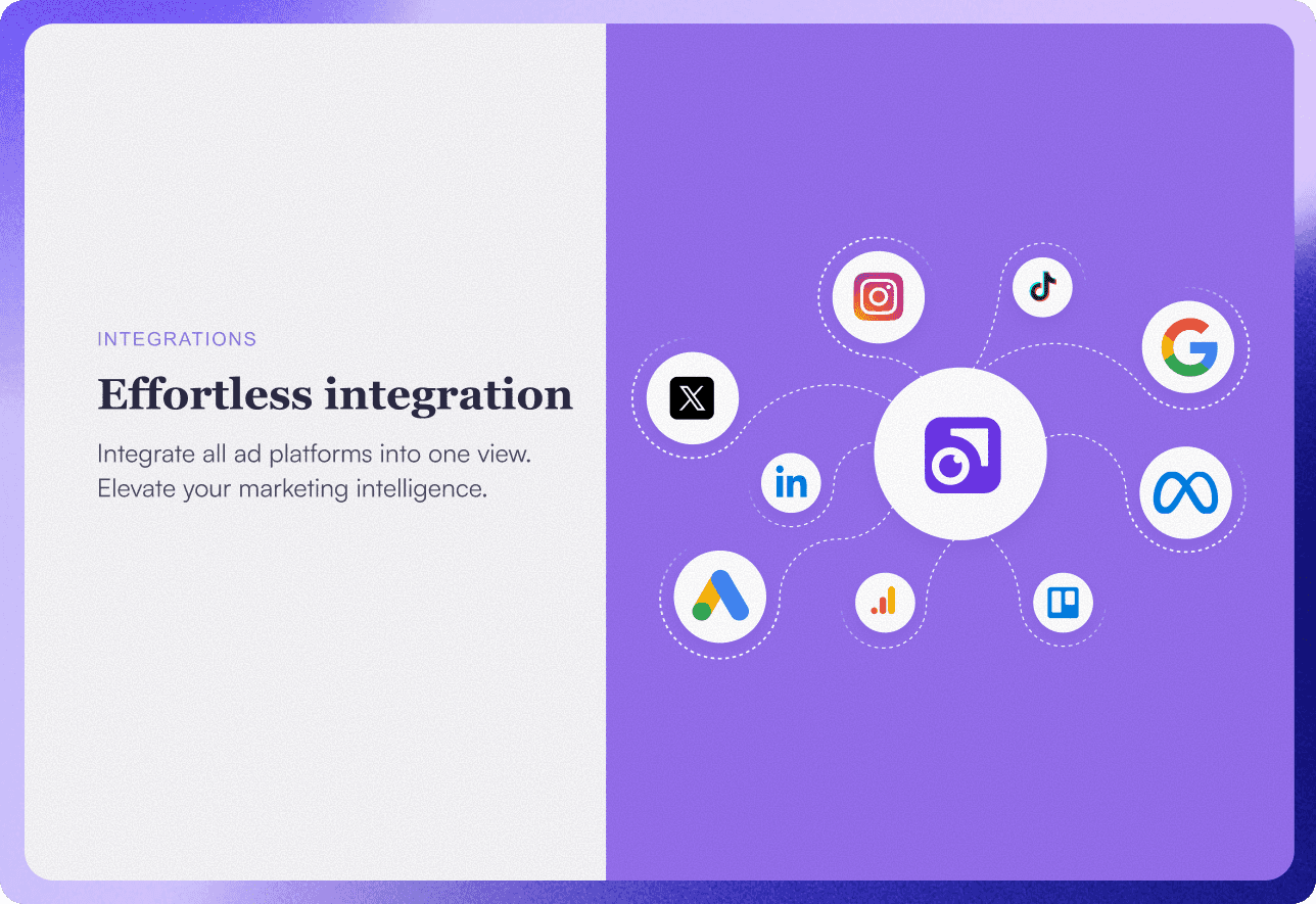
Integrations: At first, I had platform logos scattered in a line. It looked cluttered and didn’t feel like a hub. In the final version, I anchored them around a central nucleus—suddenly, it felt like “everything flows into one place.”
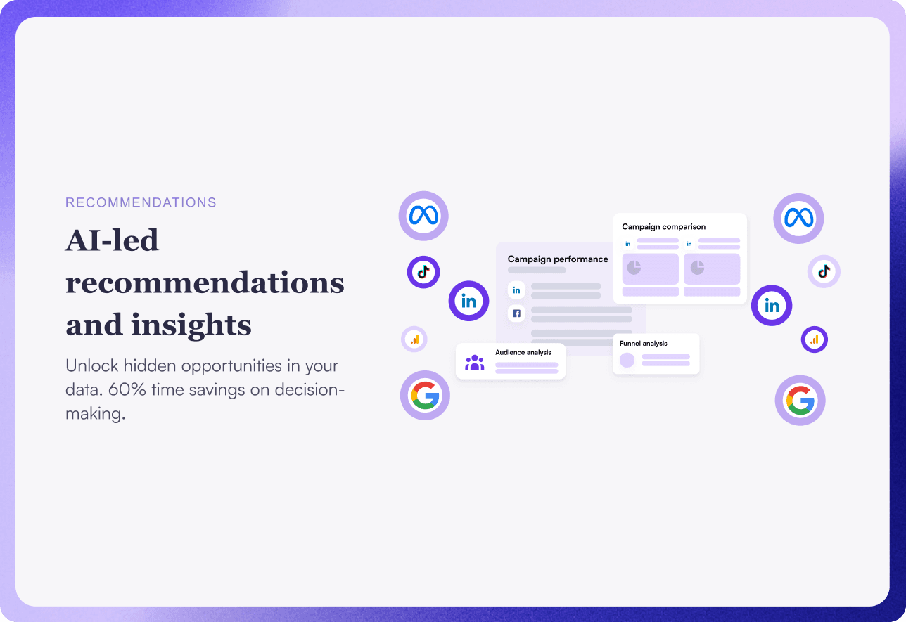
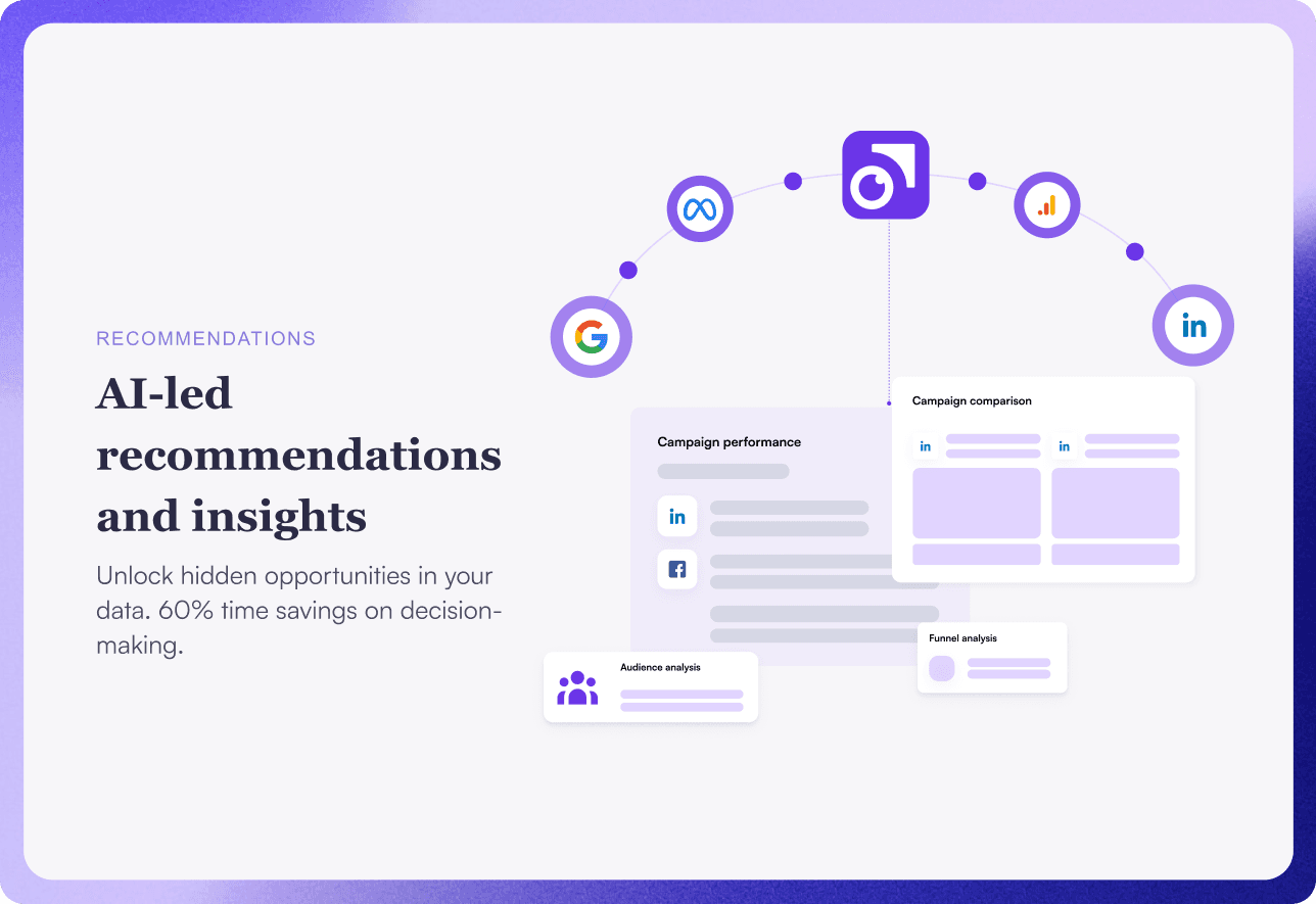
AI-led Insights: My early take looked like a generic dashboard. After reworking, I added callout cards and subtle arrows so the AI’s “guidance” was clearer.
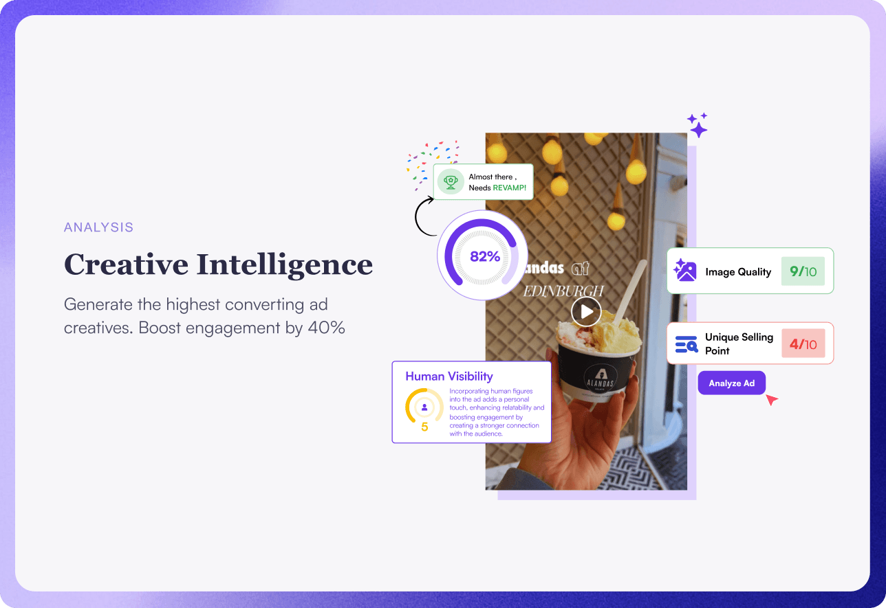
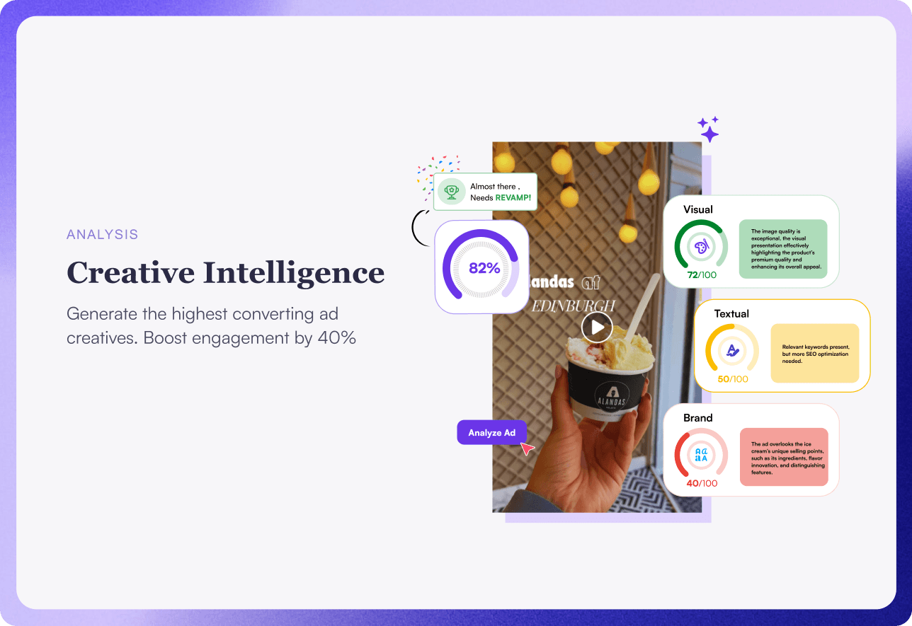
Creative Intelligence: The first draft mixed too many props, so the creative asset got lost. The final focuses on one main creative with performance badges orbiting it.
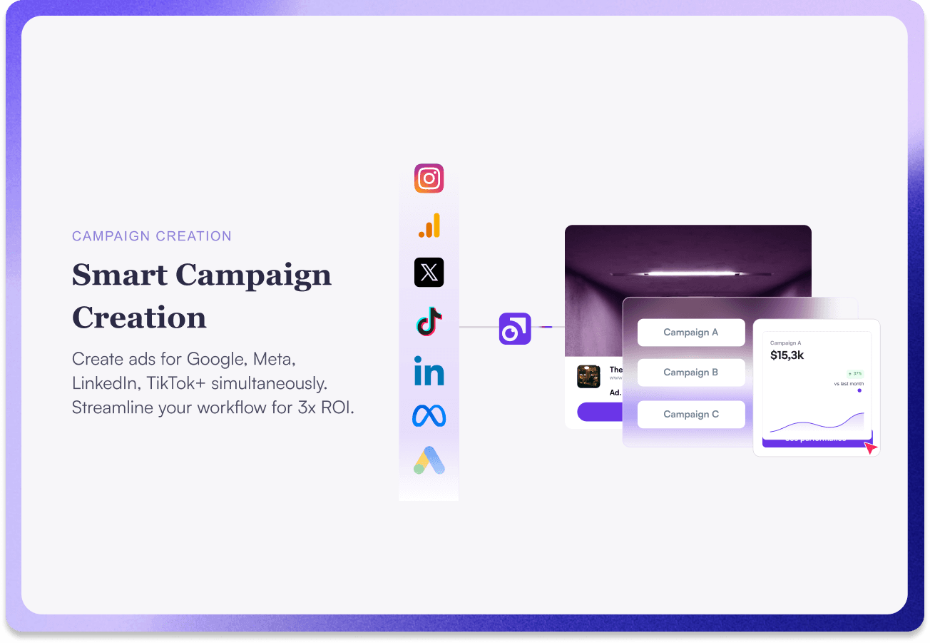
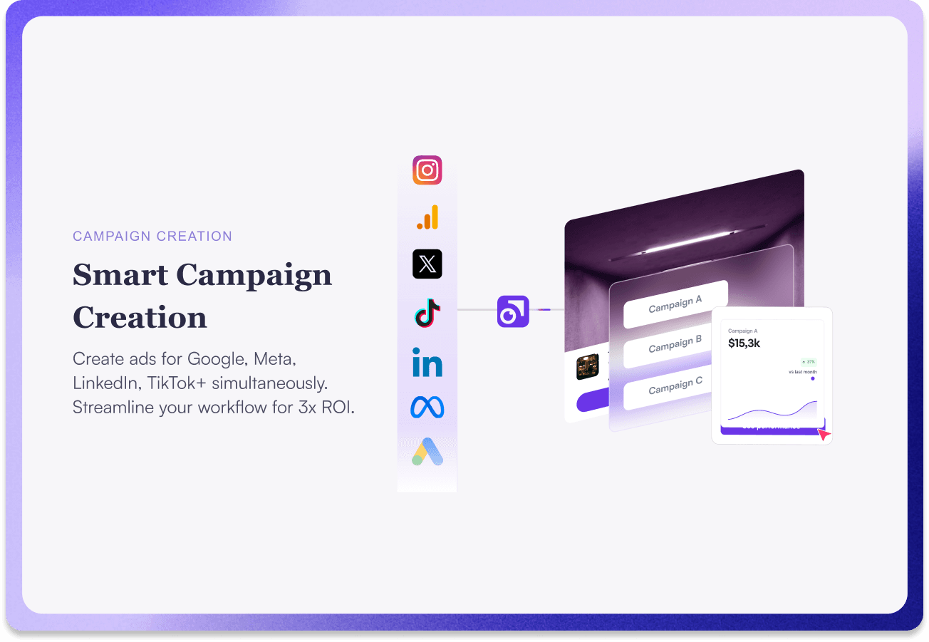
Campaign Creation: Initially, it felt like a crowded checklist. I simplified it into a step-by-step flow, so it reads naturally: inputs → process → outcome.
Illustrations that didn't work
I’ll start with the early versions — the ones that didn’t quite land - and then show you the tweaks and shifts that helped me get to the final, approved designs. This stage was all about trial and error — sketching, testing metaphors, and realizing that what looks good doesn’t always tell the story right away.
Final approved designs
And when comparing the final (approved) versions with the early explorations, three refinements stood out:
Visual system & scalability
Let me take you BTS and walk you through how each illustration evolved. I’ll start with the early versions — the ones that didn’t quite land - and then show you the tweaks and shifts that helped me get to the final, approved designs. This stage was all about trial and error — sketching, testing metaphors, and realizing that what looks good doesn’t always tell the story right away.
Closing note
Abstract SaaS ideas are easiest to understand when the metaphor is simple, the hierarchy is obvious, and the system is reusable. This set for Thirdi keeps the promise: one glance to get it, one system to scale it.
Work involved
I led the illustration journey from start to finish — shaping concepts, exploring styles, and crafting final vectors that could live seamlessly across web, presentations, and marketing.